

Welcome!
This past week, I was thinking about the best approaches to tracking success in our design work. It got me reflecting on how often it can feel like these aspects of design can suck the creativity right out of the process. I’ve heard this sentiment from many designers, and I completely understand. The thought of reducing our innovative ideas to a set of numbers can seem stifling. But here’s the thing: it doesn’t have to be that way.
Let’s be honest—Key Performance Indicators (KPIs) can feel restrictive, sometimes even scary. What if we don’t end up meeting them? I get it—this feeling can be intimidating. But rather than seeing this as a failure, I encourage you to reframe it as an opportunity—an opportunity to learn, dig deeper, and understand why things didn’t go as planned.
This kind of insight is invaluable and can lead to actionable changes that help in many ways—from aiding in selling ideas, gaining a clearer understanding of users, to ultimately improving your creative problem-solving efforts.
With this in mind, in today’s post, we’re going to focus on one specific KPI that I believe is essential for any designer: Task Success Rate. I’ll share with you how this metric can be leveraged in UX/UI design-specific use cases to not only measure success but also boost your creativity. I’ve also decided to include two more pieces of content that I hope you’ll enjoy: a highlight of a cool tech product or feature that I came across this week, and a trivia question to spice things up! Hope you enjoy today’s read!
Enjoy!
Cristian Pineda
Trivia

As promised here’s this issues trivia question:
What was the first product to have a barcode?
I’ll reveal the answer at the end of the article!
Task Success Rate
Now, let's dive into it. You’re probably wondering what exactly Task Success Rate is, when it’s used, and how to apply it in your design process. Not to worry—I’ve laid it all out for you below.
What it is:
The Task Success Rate measures the level to which customers can successfully complete tasks while using a product. It’s a key indicator of how effectively your design enables users to achieve their goals.
When it’s used:
This metric is particularly useful during usability testing and after launching a product update. It helps assess whether design changes have made it easier for users to complete essential tasks.
How to use it:

To calculate and report the Task Success Rate, follow these steps:
Define a goal, a task, and success tiers related to those tasks.
For your convenience, here are four success tiers defined by the Nielsen Norman Group, that I use and have found to be extremely helpful
Complete Success:
Users complete the task successfully with no errors.Success with a Minor Issue:
Users complete the task but encounter a minor issue.Success with a Major Issue:
Users complete the task but with significant difficulty.Failure:
Users are unable to complete the task.
Through testing, categorize user outcomes into your success tiers:
Report the percentage of users who fall into each category. For example:
20% of participants were able to complete the task successfully with no error.
50% of participants completed the task with a minor issue.
20% of participants completed the task with a major issue.
10% of participants were not able to complete the task.
When reporting these figures, it’s crucial to include a confidence interval, which provides an estimate of how these results would generalize to the broader user population.
Note: A confidence interval tells you that if you repeated the test with a different group of users, the percentage of successful completions would likely fall within a certain range. For example, you might say, "We expect that between 13% and 29% of our overall user population would be able to complete this task with no errors." This gives you a better sense of how the results from your sample might apply to all users.
Main Takeaway:
The Task Success Rate is a powerful tool in the designer's toolkit, offering deep insights into how effectively users can achieve their goals with your product. By focusing on this metric, you can identify areas of your design that may need refinement, ensuring a smoother and more intuitive user experience. Remember, it’s not just about whether users can complete tasks, but how easily they can do so. Incorporating Task Success Rate into your design process can help you make informed decisions, boost your creativity, and ultimately deliver a better product.
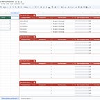
Try my template!

While working on the podcast for today’s post, I realized that setting up testing can sometimes be a headache. So, I created a template to help you get started on your next user testing journey! I hope you find it helpful.
References:
Cool Tech of the Week

This week, Google announced Add Me on the Pixel 9, an AI-powered feature designed to solve a common problem we all face: getting everyone into a group photo without the need for selfie sticks or asking a stranger for help. So we can finally say goodbye to awkwardly wide and angled selfies… well, at least for Pixel users, that is.
Why It’s Cool:
Add Me allows users to create a group photo that includes everyone, even the person who originally took the photo, by merging two images. The feature guides you through taking two separate shots and then uses AI to seamlessly combine them, ensuring that no one is left out. No more awkwardly tilted selfies or missing members in your group shots.
Design Insights:
This feature is a great example of how AI can enhance user experiences by addressing everyday challenges. For designers, it’s a reminder to think about how technology can be leveraged to solve similar problems in creative ways.
Trivia Answer

In case you’re still wondering, the first product to have a barcode was… Wrigley’s chewing gum. Talk about sticking to record-keeping, huh?
All jokes aside, it’s amazing how something as simple as what is essentially a stamp has dramatically changed how society keeps track of records and inventory. It’s saved probably millions of hours that previously spent on tedious tasks. This is a great example of how innovations that improve our day-to-day lives can come in all shapes and sizes.
Ps. Learn more about the history behind the invention by listening to the podcast!
Thank you for reading today’s post!
I hope you enjoyed this week’s issue of “Cristian Talks Product Design.” Your feedback is incredibly valuable and helps me improve and deliver content that matters to you. If you have a minute, it would mean a lot if you could complete this quick 3-question survey!
